The art of Charts
If you think about BI, you’ll normally think about charts: line charts, bar charts, charts on a dashboard. They’re kind of a fundamental part of any BI tool.
At Lightdash, our goal is to make our charts incredibly customizable for power users, but with great default settings for everybody else.
We hadn’t really updated our charts since we first launched Lightdash back in April 2020 and we were getting feedback that the charting options in Lightdash were pretty limited. The folks from Art Processors needed big number charts, Mark Rittman posted about Lightdash in his blog and said “the range of charts, configuration options[...] are still fairly primitive”, Andre de Vries pointed out that our default colour palette was not colourblind friendly (and you couldn’t even change it!)...and there was more.
Our users were totally right.
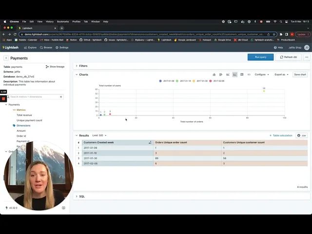
At the beginning of the year, our charts looked something like this:

This was good enough to get us up and running, but it was definitely time to give our charts a makeover.
Building the ability to build charts
...is pretty complicated.
So, we wanted to make sure that we broke up our plan for revamping charts into smaller bits that we could tackle one-by-one. We did a bunch of user research, created some designs, and came up with a plan for how we wanted to update our charts:
Version 1: I can change settings that affect the whole plot on cartesian chart types. (e.g. I can change the axis labels, I can add metrics or dimensions on the x & y axes)
Version 2: On cartesian chart types, I’m able to control the settings for multiple different series on the same plot. (e.g. I can add different chart types to a cartesian chart, I can add multiple y-axes)
Version 3: If I have multiple series on the same plot, I’m able to adjust how these are shown within a single chart type. (e.g. adding stacked bar charts, adding % stacked area charts)
Version 4: I’m able to add lines to my plot that aren’t included in my results table. (e.g. adding a moving average, adding a goal line)
Version 5: As a more advanced user, I’m able to add more complex settings using nested settings options. (e.g. within the value label, I can adjust the format of the label)
So, over the past two weeks, our mighty engineering team of 3 migrated our backend to support these more custom chart configurations (a massive effort), then smashed out the Version 1 of our updated chart configs. While they were at it, they also added some new chart types requested by our users.
No biggie.
So here it is, our updated charts space!
Some of our favourite updates include:
Being able to plot any field on the x or y axis
Gone are the restrictive days of only dimensions on the x-axis and metrics on the y-axis. Now, you can have it all! Plot those metrics on your x and y axis, analyze those correlations, enjoy the freedom.

Customizing your axis labels
The default labels for your axes just aren’t cutting it? No worries, count unique users can now be easily customized to something much more memorable (and useful) like: katie’s super cool metric.

Adding value labels to your chart
No more whipping out your ruler and quick arithmetic to figure out what the “value of that column between 30 and 35 is.” Now, you can just add value labels to your charts and take it all in. Easy.

Table chart type
Sometimes, you just need a simple table. So, we built you just that: a table chart type. It takes exactly what’s in your results table and displays it as a chart - so you can save it, share it, and keep it simple.

Big number chart type
Big number chart types are here, and they’re big. Add a metric to your table, then click on the big number chart type to see (and maybe even share) your big number.

Changing the colour of your series
Nothing’s more fun than picking your favourite colour to put on your chart, right? (or maybe that’s just me...) In Lightdash, you can now change the colours of the series in your chart, so you can truly make your charts into art.

We’d love for you to try it out yourselves, and give us your feedback!
We’re still working to improve our charts, but we think they’re only going to get better from here. Right now though, we’d love for you to play around with the changes we’ve made already and tell us what you think.
If you’ve:
deployed Lightdash locally, update your instance then try it out
are on Lightdash Cloud, your instance should be on the latest version - so you should see all the changes already live!
aren’t using Lightdash, but want to try it out anyways? Check out our demo project at demo.lightdash.com
Any and all feedback is welcome :) You can open an issue in GitHub, or come chat to us in #tools-lightdash in dbt’s slack.
Happy chart-ing! 🎉

Ready to free up your data team?
Try out our all in one open, developer-loved platform.