
If I describe our old homepage, you'd picture your own. A hero line, a product shot at a three-quarter angle, a logo strip, a row of feature cards underneath. This is the standard for most SaaS companies. For our latest website brief though, we wanted to build something different, we wanted it to be polarising and split opinions. Lightdash has always been built on the idea of strong opinionation, so we decided it was time to extend that to our homepage too.
What we built as a result is now live at lightdash.com.
Just a few weeks ago, I'd never built a 3D asset or even animated one. Now, I’ve built our whole homepage onto a Game Boy. So, these are the lessons that got me from zero to shipped.
Lesson 1: Know what risks you’re willing to take before you start building
Building a divisive homepage means some traffic will bounce. Users will land on your website and may get confused and log off quickly. So, we had to decide upfront whether that was an acceptable cost for us.
The reason this is so important is that half-committing is worse. If you compromise on some of your design to make it less polarising, you’ll get an odd website with no upside: it’s too weird to convert the skeptics and too safe to be talked about.
We agreed early on that losing some visitors would be the price of building this site, and we agreed this with marketing who own the website metrics so everyone was in the loop. This meant that every discussion afterwards was about idea execution instead of whether we’d lose traffic.
Lesson 2: You don't need to model 3D hardware; you can generate it in code
The new Lightdash homepage is a single file of 6,112 lines running three.js. The console shell, cartridge, buttons, and navigation planets aren't modeled in a 3D tool; they're generated at runtime, along with the dithered shadows, glows, and pixel sprites baked onto canvases while the page loads.

Using code was the easiest way for me to build the website because it meant that every part of the 3D hardware was a function. I could tweak and re-run it as many times as I wanted, rather than build a mesh I didn't know how to sculpt.
Having never built anything like this before, it was surprisingly straightforward to pair the implementation on the engineering side with my vision for it.
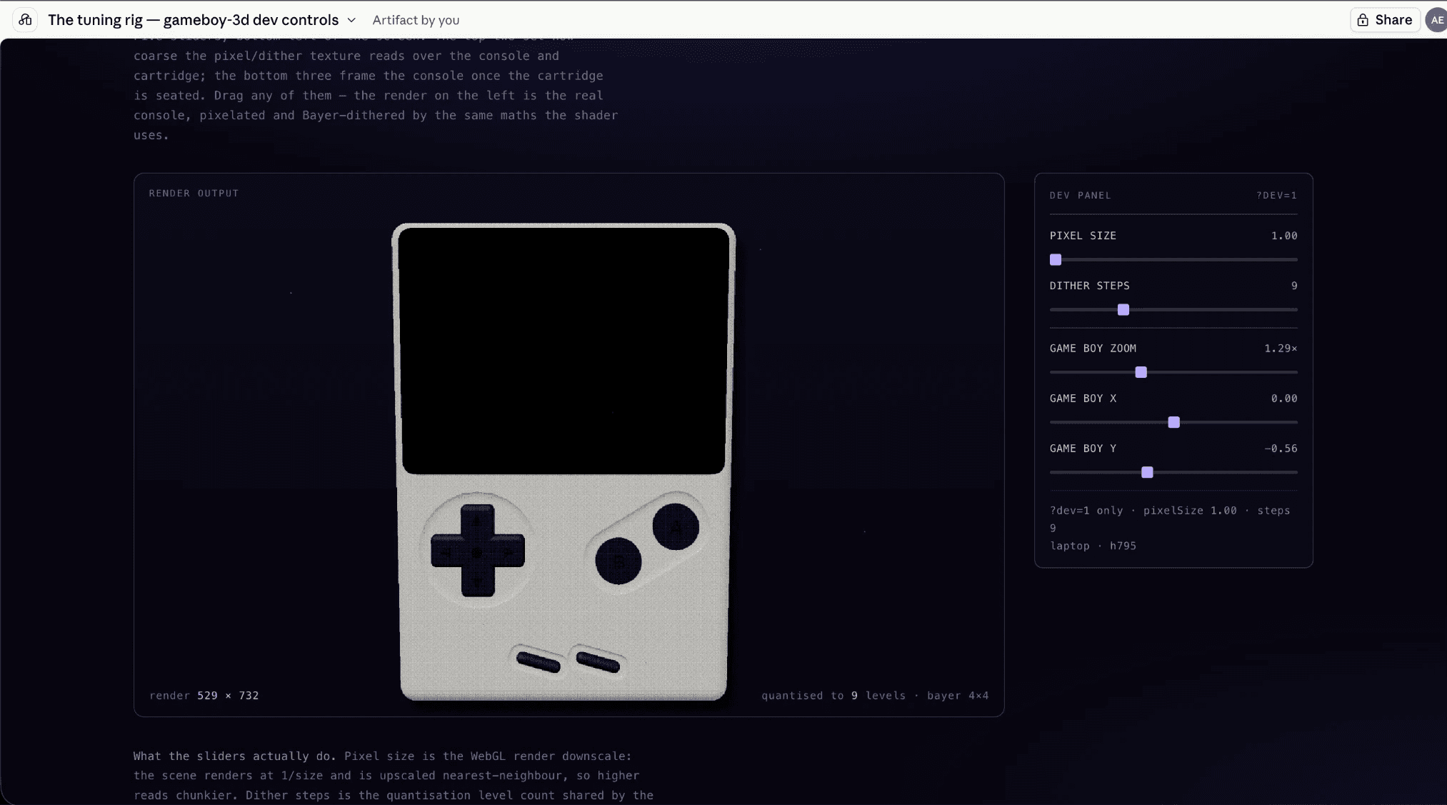
It's also what made the details tunable: I coded in my own UI interfaces to control the scale, spacing, and positioning of all my elements. I also used this to ‘fine tune’ my textures such as the pixel density to my exact liking.
Lesson 3: The hardest problem is deciding what to cut
Once I started building, the first problem I ran into was trying to fit our whole product inside one console screen. What seemed like a design flaw (i.e., a console screen too small to fit our homepage copy), was actually a content design problem. And that’s why it’s important to get your marketer involved before you start building.
We knew there was no way we could get everything onto the new homepage. The new format was already overwhelming, so we wanted the content to be as simple and easily digestible as possible.
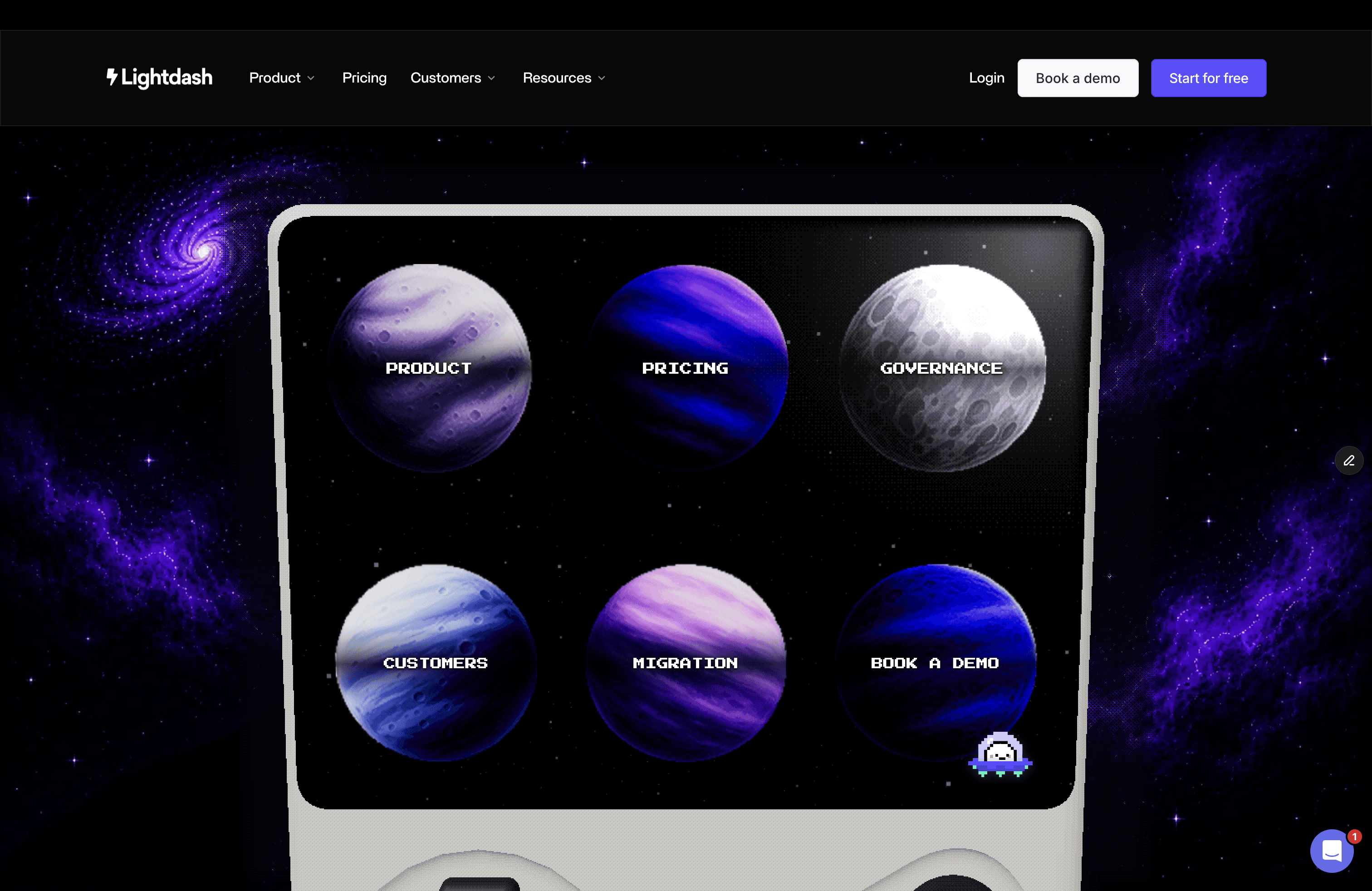
While this was a hard problem to solve, it was a great exercise in simplifying our offering down as much as we could. Ultimately, we were able to settle on 6 sections that we felt did justice to our platform. We cut things I would have defended on a typical homepage, and the page is better for it.
Lesson 4: Done is better than perfect
This lesson showed up twice.
First, we realised the console wasn’t working for mobile view. At phone width, the screen inside the hardware was too small to be legible. After trying multiple things to make the console work on mobile view, we decided to make the console drop away and have the screen fill the viewport after the Game Boy boots. This way, you keep the pixel-art navigation and lose the plastic shell. Every section fits one screen with no scrolling, and the type snaps to a 4px scale measured at 390×844.
The second problem occurred when we found out the entire homepage doesn’t work on older browsers.
I found out that Gecko treats pixelate filters, rounded-corner clipping, and 3D matrix transforms differently enough that parts of the interface visibly tore. Three of those I fixed, each fix gated to Gecko so Chrome and Safari render exactly as before. The fourth I couldn't: Gecko rasterizes a perspective transform in a way that shredded the overlay, so on Firefox the tilt had to go. Now, the console locks dead-on and the dot-matrix dissolve becomes a clean fade.
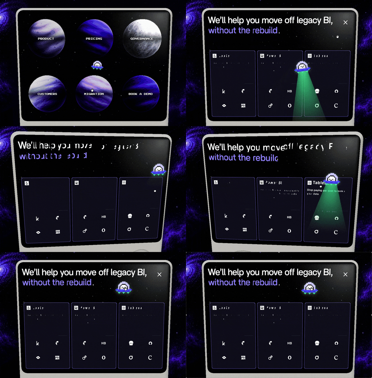
So on both occasions, we decided a homepage that renders wrong is worse than one that moves less.
I broke our build into parts you can steal from
Because the how is more useful than the what, I pulled the whole build apart into an asset lab.
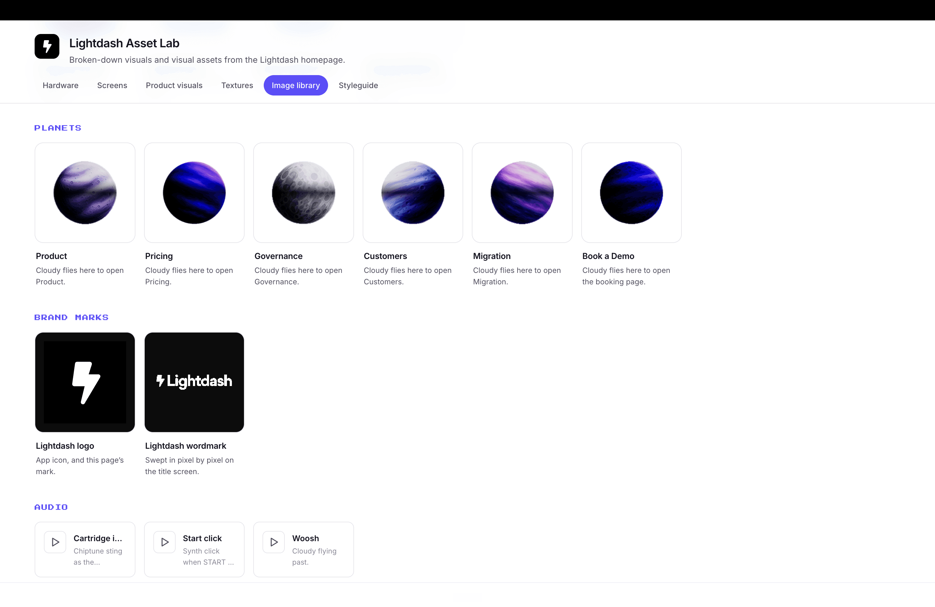
Every 3D part, screen, and product visual sits isolated running its real animation, next to the runtime-generated textures. It's sliced out of the live code to become part of Lightdash’s growing brand. It's easy to source and speeds up prompting Claude for future projects as a direct reference point.
let'
I built this whole homepage as a one person design studio: concept, 3D, build, visuals, copy edits, responsiveness, the browser bugs. There was no waiting for an engineer to translate the design into code.
Cursor’s Head of Design, Ryo Lu, calls the lines between designers, PMs, and engineers “muddy”: people do what they’re strongest at, and agents connect the rest. Everyone is a builder now.
But easier building doesn’t guarantee better ideas. When AI does the thinking as well as the execution, everything drifts towards looking the same aka AI slop. That’s why a strong point of view matters. Some people will love this site and others will hate it; but I’d take either reaction over building something that blends in with everything else out there.
Have a look at lightdash.com and let me know what you think. Best on desktop, with the arrow keys or your mouse.
Or pull it apart at the asset lab if you want to build one yourself.
Ready to free up your data team?
Try out our all in one open, developer-loved platform.